compass

Traumatic brain injury (TBI) is the leading cause of acquired disability for children and adolescents in the US. Outcomes for children who have suffered from TBI are contingent on their ability to receive continuous rehabilitation therapies after discharge from the hospital. Statistically, outcomes are worse for patients of families with low health literacy and limited English proficiency, who experience additional barriers to access care and who have a poor understanding of their child’s illness and treatment after being discharged.
Partnering with Seattle Children's Hospital, my teammates and I conceptualized and designed a tool to support patients with TBI with resources they need for the rehabilitation process at their own home.
UX Researcher
UX Designer
Project Manager
10 weeks - planning and logistics
10 weeks - execution
How do we design a system to provide guidance and support patients with Traumatic Brain Injury and their family to maximize their recovery after discharge?
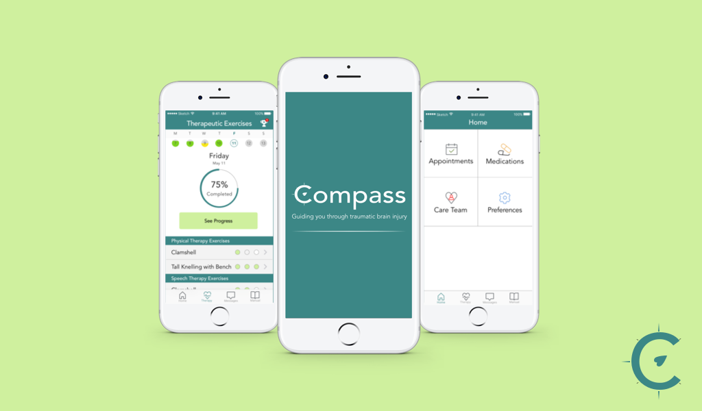
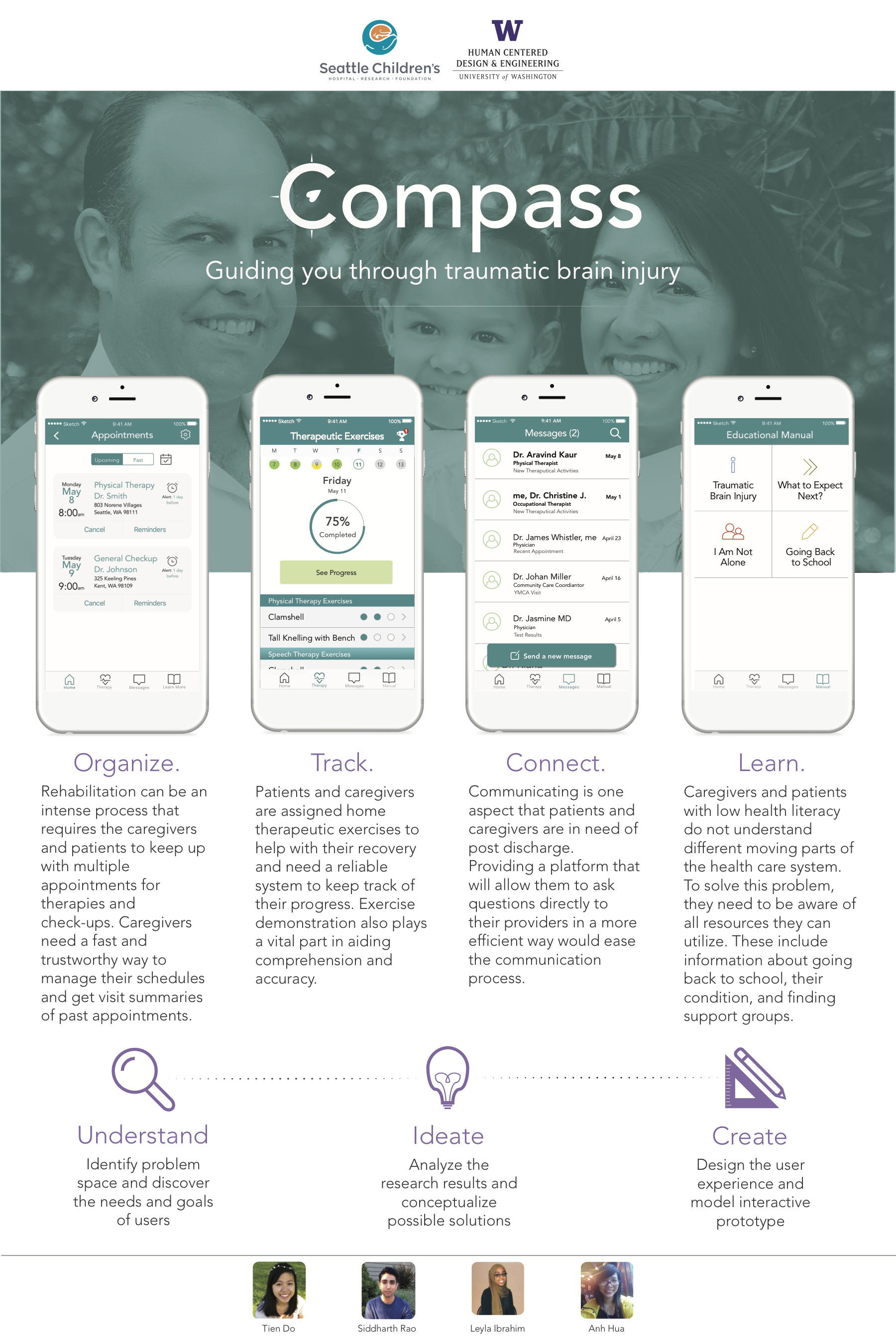
After going through the User-Centered Design process, our team addressed this problem with the Compass mobile app - an app designed to act as a companion for patients and caregivers provide guidance and support to TBI patients and their families by:
The project was presented at the HCDE Open House and received positive feedback from sponsors, peers, and guests.
Compass was created through an iterative design process that focused on understanding users and being sensitive to their needs.

To understand the problem space and our targeted users' needs, we conducted extensive user research

With the findings compiled from research, we brainstormed numerous solutions to address the problem

We built and tested our design with various prototypes of different fidelity levels
Our goal and targeted audience for this project was highly specific. We wanted to build a resource system to most effectively serve pediatric patients and families with low health literacy and limited English proficiency. With this demographics, there are added challenges when they embarked on the journey of getting their children the healthcare they need.
These are the main areas that we want to understand with our research:
These are the research methodologies we employed:
Literature review was chosen as the first step because there had been many studies done on the subject and it would give us a high level understanding of the context and our area of focus.
We reviewed academic papers to learn about Traumatic Brain Injury as a condition, how it affected patients and family members as caregivers.
Additionally, we also looked at papers detailing the challenges that people with limited English proficiency and low health literacy face when navigating the system and strategies to design for this population.
Our sponsors at Seattle Children’s Hospital provided us with interview transcripts with our targeted demographic from their previous project. Analyzing this resource helped us learn about the types of resources that were available to help our users, as well as how they navigated the healthcare system after getting discharged.
To complement our dataset and gained more insights on how our targeted population navigate the healthcare system and utilize resources, we conducted 6 interviews with different demographic:
All patients and caregivers had low English proficiency and/or low health literacy.
When possible, the interviews were conducted at participants’ homes. This allowed us to observe the space that our products would be used in and looked for specific design opportunities.
This project aim to create a system that would act as a companion to patients and caregivers through every step of the rehabilitation process.
In order to understand current technology and resources available to patients and caregivers, we studied the interactions of health care applications that helped patients manage and track their therapeutic exercises, appointments, and medications.
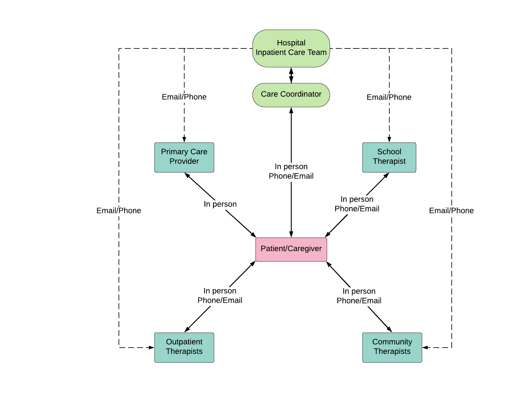
During the time patients stay at the inpatient unit, all of their rehabilitation needs are met through the in-patient care team. However, after discharge, to get the care they need, patients and caregivers are left to navigate a large and complex healthcare system on their own.
Variable factors such as level of physical and mental functionality, independence, and financial capability will determine whether they need to seek care from hospital's outpatient clinics, community-based therapy, school-based therapy, and private rehabilitation services.
At Seattle Children's Hospital, patients sometimes work with a Care Coordinator to help them with this journey.
Based on the findings, we created a visualization depicting how providers communicate with one another and with the caregiver/patient in order to gain a holistic view of the system and highlight the gap in communications that need to be addressed.
From the research insights and a consulting session with our sponsors, we created three personas.
The personas promote empathy and help us understand what motivates our users as well as their problems. Each persona shares some similarities but also has different specific needs to be addressed.
The PDF version of the personas are linked here.
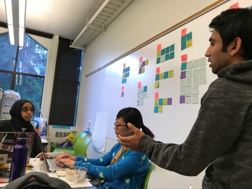
Using personas and research findings, we discussed, brainstormed, created affinity diagram to sum up design findings and key focus.
From these insights, we sketched as a group to generate design ideas.
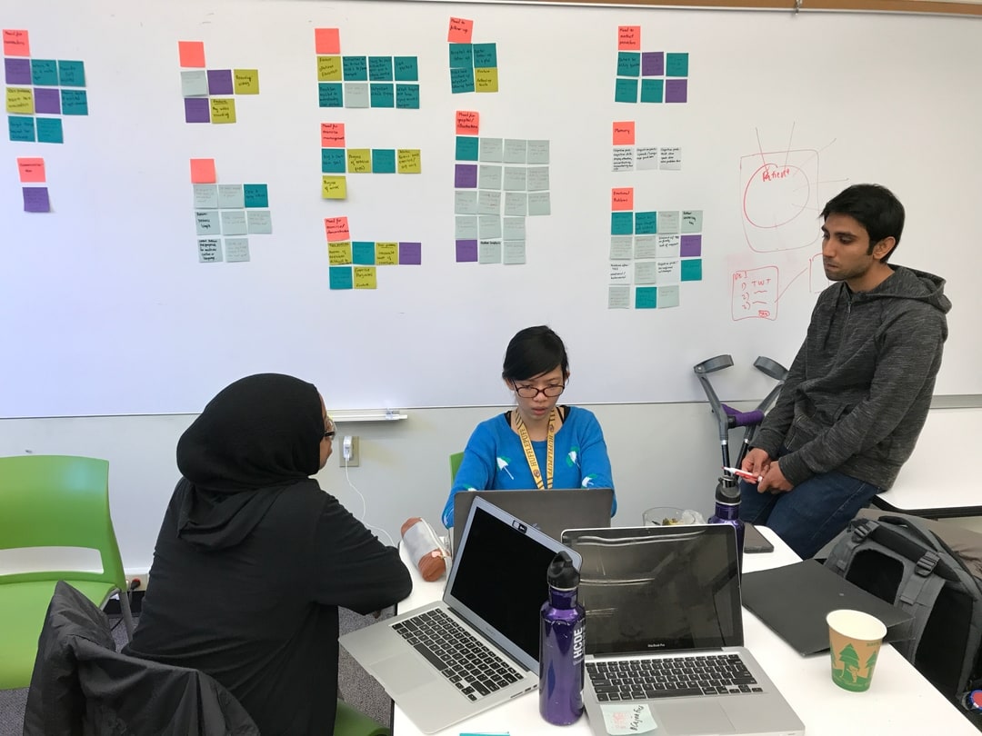
We identified 3 areas of prominent needs to focus our design efforts on.
We built several prototypes and conducted usability testing to evaluate our designs.
I acted as the Project Manager for this phase.
The goal of the design was to connect all of the fragmented pieces of the system that users had to navigate. The areas of design focus are below:
We built several prototypes and conducted usability testing to evaluate our designs.
I acted as the Project Manager for this phase.
Each of the team member took ownership of a different aspect of the application. I was responsible for the Exercise feature set.
We created paper prototypes as a mean to quickly communicate design ideas for user testing and evaluation. The low-fidelity nature of our prototypes invited user feedback and allowed for quick iteration.
To test interaction flow, interactivity was added with Marvel App.
Link to the prototype: https://marvelapp.com/22dc703
Paper prototype of the exercise feature:
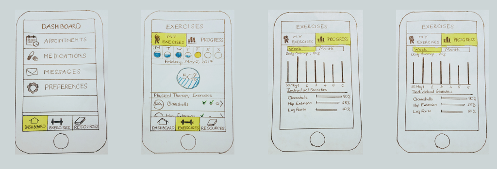
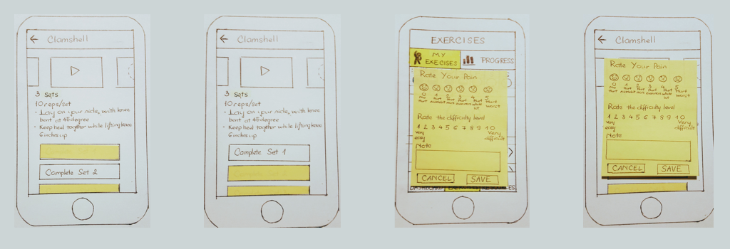
We conducted 5 usability testing sessions using the interactive paper prototype to gather feedback on the functionality and interaction. Participants were asked to complete different tasks from each feature sets:
Using insights from observation and participants’ comments,we produced a list of key findings. Each finding was converted to actionable design recommendations that were used to improve the usability of the application.They are listed below:
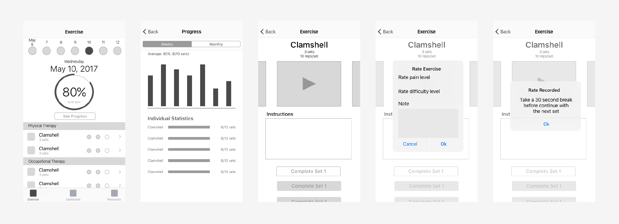
Wireframing acted as a bridge between the physical medium and digital medium. This step helped us think in digital components and iOS design guidelines while still retained minimalistic design components.
We created high fidelity mockup of our design with Sketch and InVision.
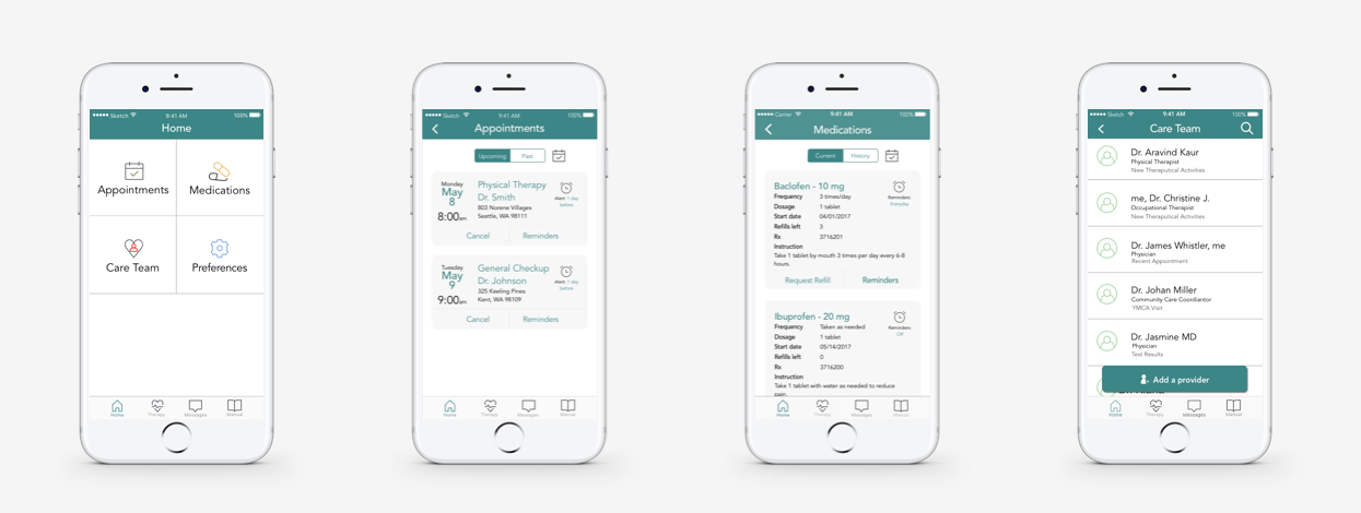
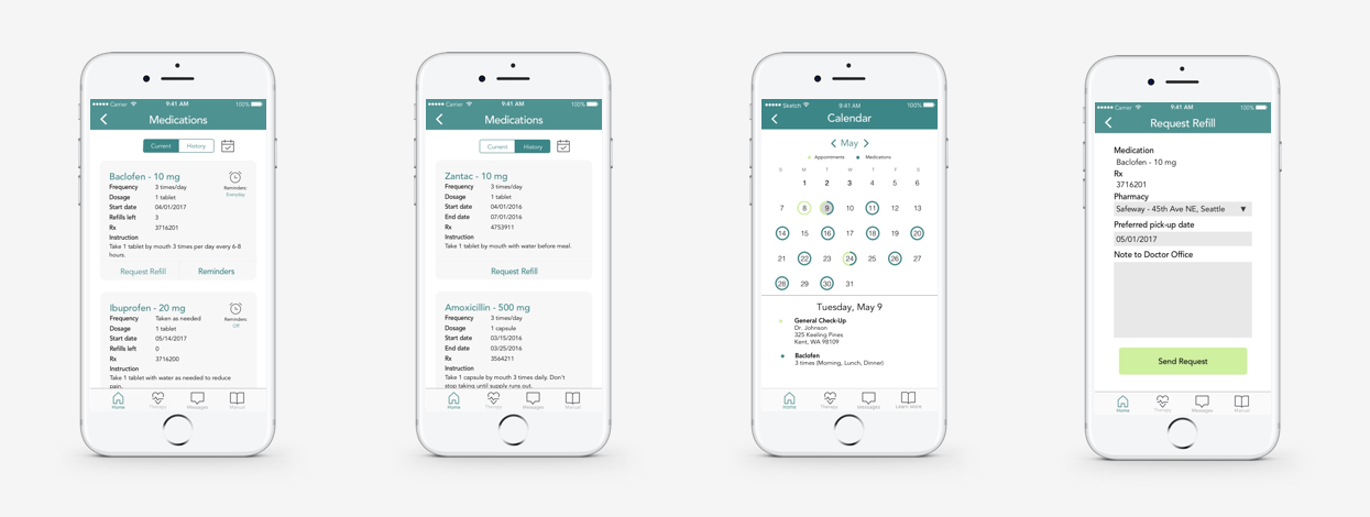
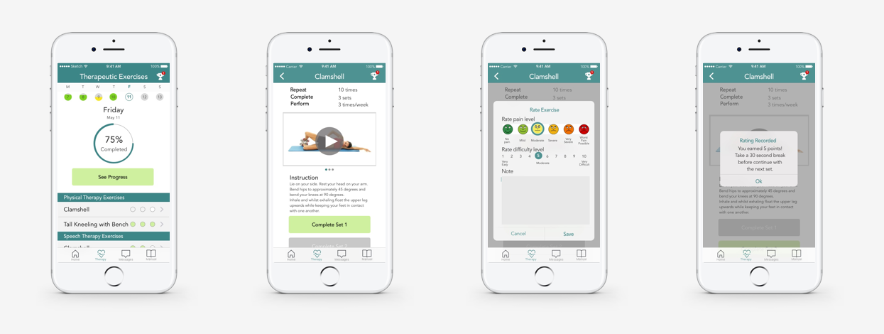
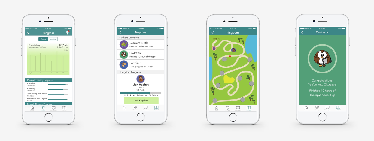
The project encountered many challenges because of the nature of the population we wanted to serve and also many roadblock in the healthcare space.
We were not able to reach out to as many of our targeted users as we had hoped within the time frame of this project.
The time constraint also did not allow us to further evaluate the usability of the application.
Moving forward, we would like to dive deeper into research and evaluating usability to make sure that the application is helpful for the demographic it intended to serve.
We would also like to do more research on Educational Materials section and figure out how to best deliver information to the population with limited English proficiency and low health literacy.