Movabile
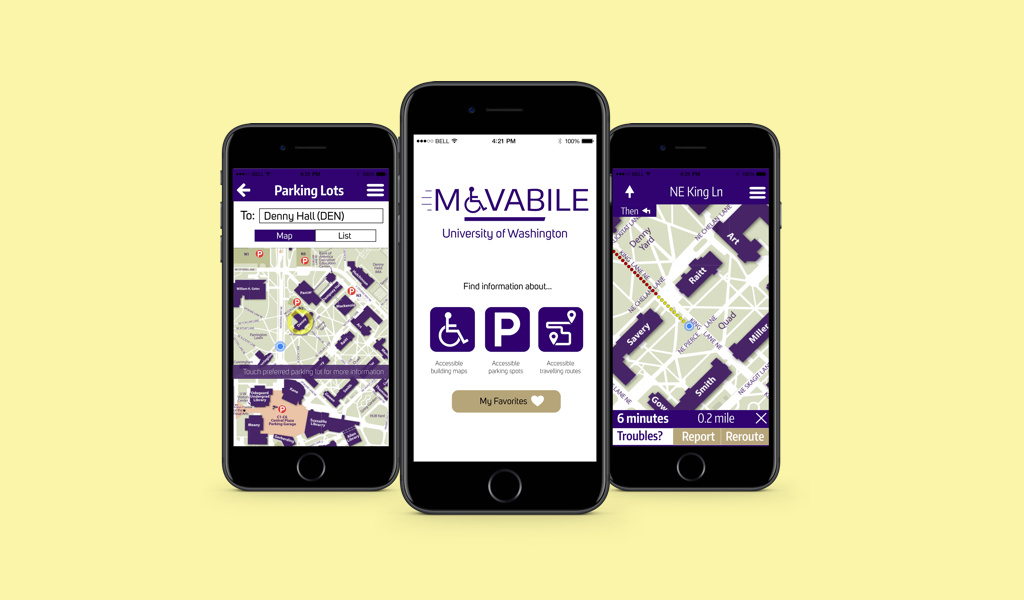

In 2012, the Census Bureau reported that nearly 1 in 5 Americans have a disability (source). With more than 46,000 active enrolled students and 22,000 faculties and staffs on campus, the University of Washington also houses a large number of people with disability. Having been built in 1861, 39 year prior to the American Disability Act was signed into law, the campus still has several buildings and pathways that do not meet accessibility standards. Moreover, the information on accessible pathways and entrances were outdated and difficult to access. This creates obstacles for people with limited mobility when they navigate through campus.
Lead UX Designer
10 weeks
How do we provide physically impaired individuals to with up-to-date information to safely navigate through the University of Washington campus?
My group of 3 conceptualized and designed a map application that would provide users with accessibility information. It also lets users contribute and report obstacles to help other users in the community.
Movabile was created with the Goal-Directed Design process to identify users’ goals and behaviors, create user requirements, and translate the requirements into design.

We conducted literature review and web research to gain abetter understanding on the topic of mobility and accessibility. These were the areas that we focused our research efforts on:
Using information gained from research, we created 2 personas representing different sets of user demographics. Each of them had different needs, pains, and desires regarding mobility.
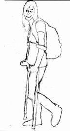
Sindy - College Student
Age: 20
Like: Coffee
Condition: Spinal Cord Injury
Mobility aid: Forearm crutches
Goals and Motivations:
Want to be able to get around without needing a lot of help.
Pains:
Have to rely on the shuttle service
Take a long time to walk from class to class
Sometimes need to take detour because of obstacles
Scenario
Sindy is an undergraduate student at the University of Washington. She became mobility-impaired 2 years ago. She is able to use forearm crutches to walk short distance. While being fairly mobile, her strength is limited and she has difficulty climbing stairs. She also tries to avoid slippery areas and pathways with steep slopes.
Sindy uses her phone very often to find directions and maps to locations on campus. However she can't tell how long it would take to get somewhere because of her slower speed.
She use school’s shuttle service to go to classes and events, but she usually has to skip out on things that happen last minute. She wants to be more independent in planning her day.
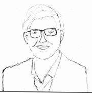
Michael - Professor
Age: 50
Condition: Cerebral Palsy
Mobility aid: Manual wheelchair
Vehicle: Adaptive van
Goals and Motivations:
Want to be on time for class
Want to find routes that are accessible through campus
Pains:
Have difficulty going uphill
Have difficulty finding parking
Scenario
Michael is a new anthropology professor at the University of Washington. He was born with cerebral palsy, and uses a manual wheelchair.
Most of Michael's class are at Denny Hall, which is located uphill. He gets very tired and flustered after wheeling himself up.
Michael commutes to work with a adaptive van. It is big so he needs to park in van accessible spots. They are difficult to find due to limited numbers and heavy traffic on campus. During rainy season, Michael wants to find a van-accessible parking spot as close to his class as possible.
We then applied divergent thinking and designed different technological solutions to meet users’ needs.
We then went through a critique session to debate feasibility, strength, and originality of the sketches. The top 3 solutions were picked out to be collectively improved as a team.
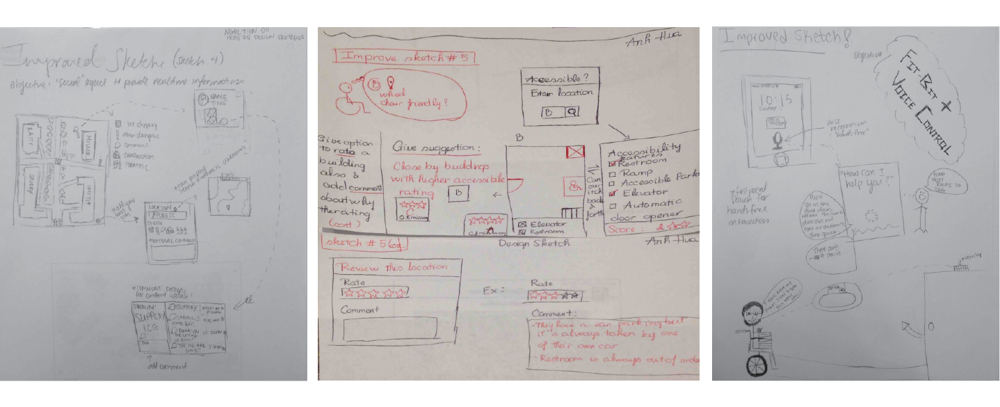
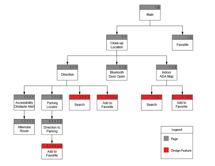
After narrowing down on the solution and achieving a clearer vision of our product, we embarked on the process to create the overall product concept, define the framework for the product behavior, and work on the information architecture aspect.
The areas of design focus were:
Getting accessible direction from point A to B
Paper prototype was created to fulfill 3 different workflows and were used to gather user feedback:
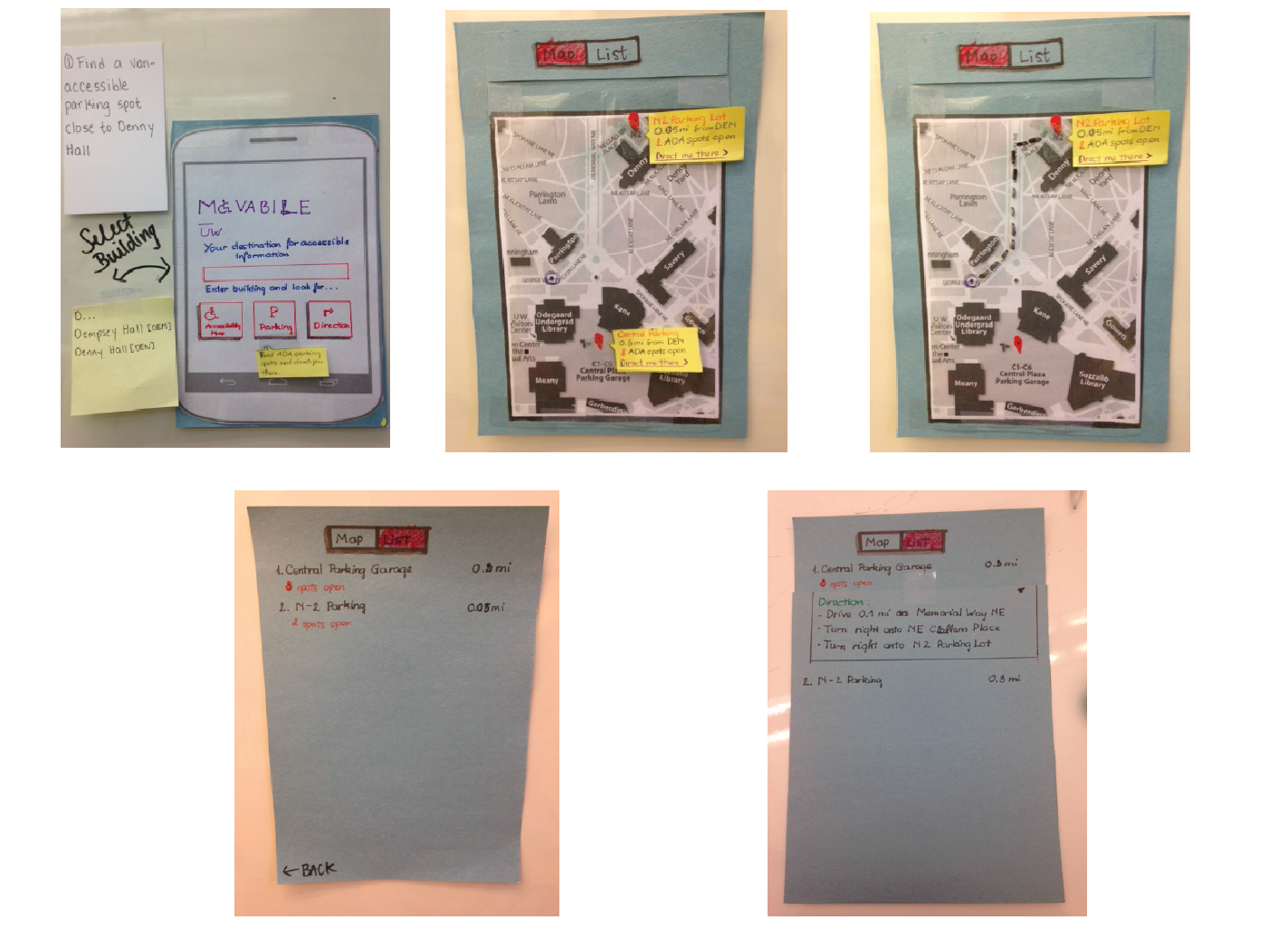

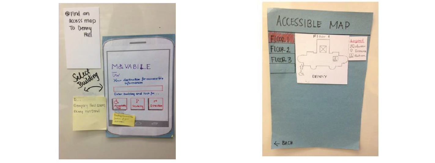
The usability test was designed and carried out in class with 3 of our classmates as participants. Due to this, they were not our intended population. However, feedback regarding interaction flow and design were helpful for refinement purpose.
We received the following feedback, and used them to generate design recommendations:
1. Participants confused accessibility icon and logo as clickable buttons
Design Recommendation: Update design to create clearer distinction between clickable and unclickable elements
2. When searching for parking, participants wanted to know their current location in regard to the parking lot location
Design Recommendation: Add current location
3. When informed of possible obstacles in their path, participants would like to have alternative routes suggested
Design Recommendation: Add option to reroute once obstacle is encountered on a path
The wireframe was created with Balsamiq and resulted in a simple digitized mockup with accompanied annotations.
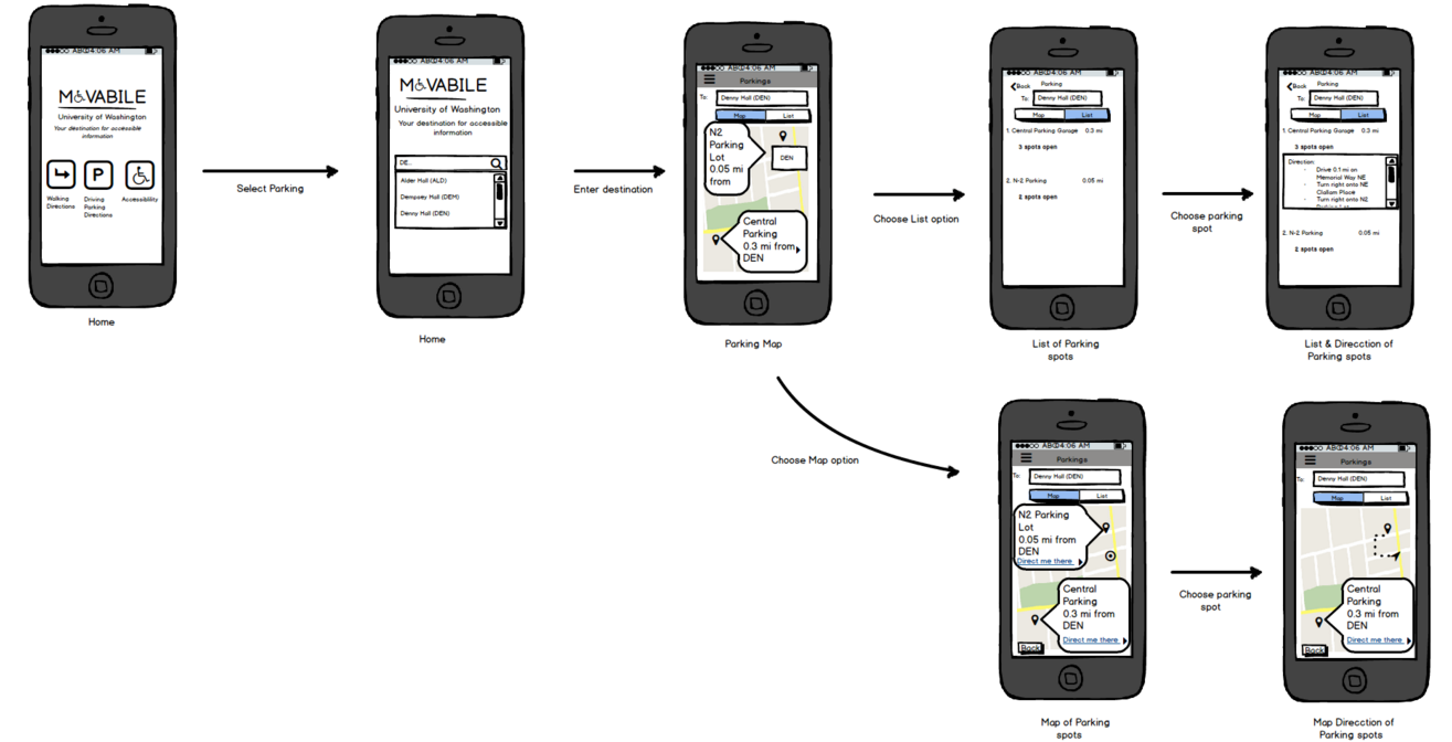
Following the evaluation and wireframe, I created the mid-fidelity mockup of the application using Adobe Illustrator.
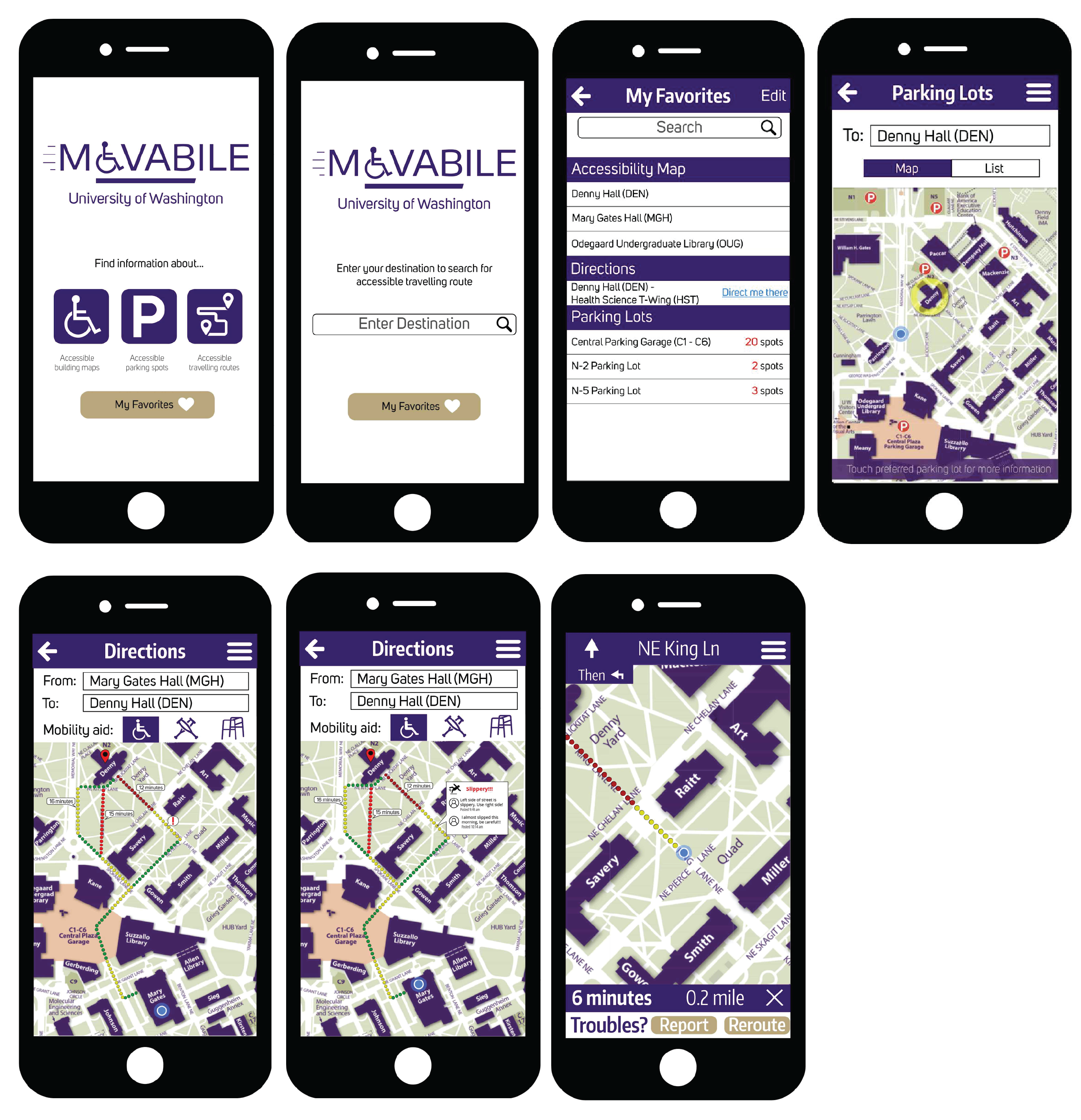
This project was the first of many projects that I took part in following the Goal-Directed Design process so it held a special place in my heart. It was very interesting exploring the concept of designing for accessibility and how to assist people with different ability.
Due to the limited scope and timeframe, we did not dive in-depthinto user research to gather goals and needs from our targeted population.Moving forward, I would like to have the opportunity to explore more accessible features to improve the usability and to better cater to our targeted demographic. Some examples include: